Posts Tagged ‘mobile apps’

h1

The Tipping Point: When Do I Need A Mobile App For My Event?

April 2, 2014

Here is the article that I wrote for the April 2014 Issue of RSVP MN Magazine. You can read the article here.handmobile-300x259


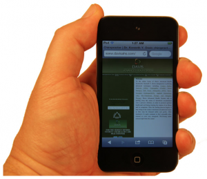
The future of computer and social interaction at events is definitely seeing an explosion in the use of mobile devices as the primary tool for your attendees to interact with the Internet and the environment at your event. Social media channels are a common communication tool for events these days, and there is also the option of creating a custom mobile application for your event. Many companies are investigating the creation of such apps for their events but are struggling to justify the expense. Here are some tips that should help you decide if a custom event application is a worthy investment for your event:

What are the demographics of your attendees?

In 2013, 64 percent of all American Internet users between the ages of 18-60 are accessing the Internet primarily through a mobile device. In any case, you will need to accommodate both mobile and non-mobile users at your event until the day where 100 percent usage is achieved.

Can you provide the same benefits of a mobile application with existing tools?

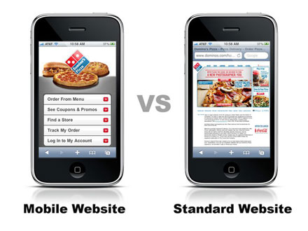
Mobile applications tout things like expedited check-in, schedules, event maps and directions, and promotional materials via a mobile device. Many of these services can be delivered via social media platforms such as Eventbrite, Facebook, Twitter, and more. It would make sense to make sure you are maximizing your efforts on these channels that are free, familiar to the attendees, and duplicate the services of a custom mobile app.

Can you offset the cost of the application with sponsorships or event partners?

A benefit of mobile apps is the space and area in the application for an advertiser, sponsor, or event partner to promote their brand. If you are partnering with an A/V or technical partner for the show, many of these firms are offering their own custom event applications as a service. The opportunity to sponsor the event app could be part of a package offered to larger sponsors of the event which would provide them a greater opportunity to have their brand promoted to the attendees.

The bottom line is that this technology is nice to have at this point, and not a need to have yet. That allows some flexibility in wading into custom mobile applications. The technology of most applications is definitely an amenity appreciated by attendees, but in today’s economy it is always nice to have a path to adaption that won’t drive up the costs of your events.


h1

The One Thing You Have To Do To Your Website In 2013

December 10, 2012

I am constantly being asked by clients and panels that I am speaking on, about how to prioritize the very limited budgets that are being forecasted for 2013 when it comes to what they can do for marketing that will give them the greatest ROI without costing an arm and a leg. Here is my best advice for 2013:

It’s no longer “good enough” to have a website and to be found on the internet. That website you invested good money into building and maybe even rebuilt once or twice in the last five years is obsolete. Visitors to your site are leaving in droves, or not even finding your site in the first place. Is it because of a lack of SEO (search engine optimization)? No. It is because you can’t be found on mobile devices.

Up until 2011 most website designers designed websites to be viewed on a 15” or larger sized computer monitor or screen. 90% of today’s Smart Phones (phones with the ability to access the internet) come with standard 2”x 3”screens, so at most, they are seeing as tiny portion of your website or your whole website in a micro-size.

Why is this so important?

According to pewinternet.org, in 2012 half of all American Adults (ages 18-60) will access the internet only through a Mobile Device such as a cellphone or tablet.

Mobile User's Frustrations

Mobile User’s Frustrations

When a mobile user visits a standard website and has a negative experience:

  • Most, over 61%, never come back
  • Almost all the rest, nearly 40%, go to YOUR competitor’s site

The top complaints of mobile users about websites are:

  • It takes forever to download.
  • It doesn’t fit on the screen.
  • The text is too small.
  • I can’t navigate the interface.
  • I have to pinch & zoom to view anything.
  • It takes too much time to use

So, what can be done to correct this? At Sterling Cross we have been researching these issues and at the request of our clients we have come up with a solution we have now added to our service offerings for 2013 and beyond! We’ve met with and surveyed over 12 of the top local, regional, and 2 national web design firms to create a solution that can meet the needs of our clients, whether they are looking for the most cost effective solution or as part of a redesign of their entire site.

The number one recommendation from almost every single website company was to do a complete website redesign and incorporate “responsive” technology where the website will detect what type of device is browsing the site (smartphone, tablet, or computer) and display that version of the site (essentially building you three sites). This is of course how all websites will be built in the future, and if you are looking for an entire rebuild of your site, we’ll gladly help you in that process.

If you are looking for a short-term or a more cost effective solution to modify your site without redoing the entire website, we now offer the following three solutions:

  1. For 95% of Custom HTML or Open Source code websites: you simply add a “Mobile Style Sheet” Which recognizes when a mobile browser is viewing the site and adapts it to mobile view. (This typically requires only a couple hours from a coder to adjust on your site).
  2. WordPress sites have a free Mobile WordPress “plug-in” that can be added to also discern who is viewing from a mobile browser and adapt the view (The WordPressbasic widget, truly is very basic. We would recommend 1-2 hours of a coder or designer to create a mobile interface template that matches your brand).
  3. If your site is not in these two categories, we can do the custom coding to do to provide a front end Responsive Bumper. This bumper recognizes the device browsing the site and seamlessly directs it to a mobile version of your website, which mirrors the data and info on your current site. We can do this on an hourly basis, without having to revamp the whole site, typically for a fraction of a total website redesign.

Please contact us for more information or if you are interested in any of these solutions. Your customers ARE on mobile, shouldn’t you be as well?

Make Your Website Mobile Friendly

Make Your Website Mobile Friendly